An architectural point of view, on paper and on screen.
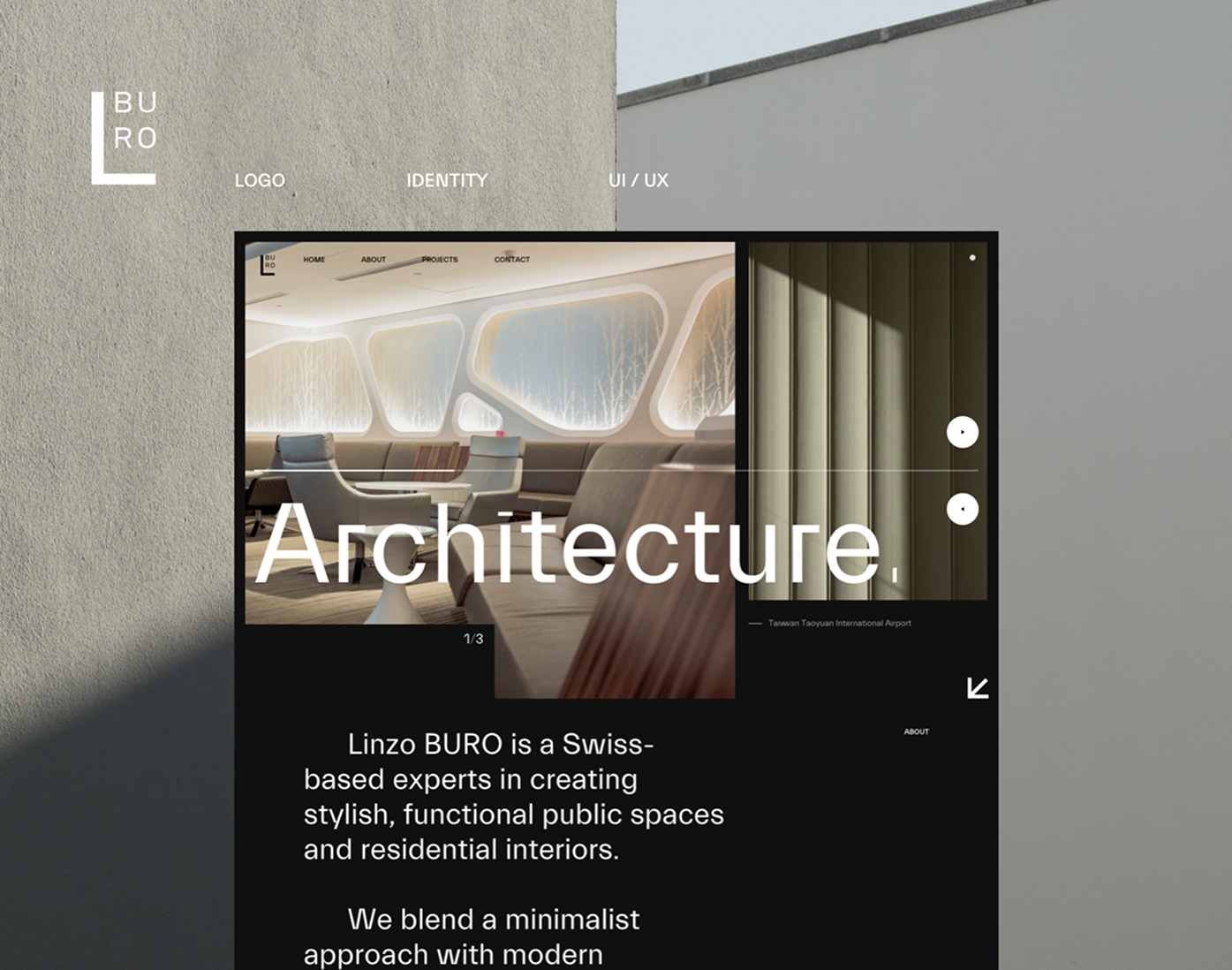
Overview
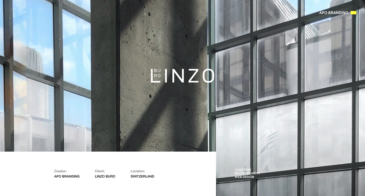
A visual identity with room for architecture.
Linzo Buro is an architecture practice with a belief that architecture shapes behaviour. Its approach combines research and practice, developing strong concepts while keeping the finished building close to the original vision.
The visual identity and website translate that outlook into a quiet, structured system. An architectural monogram, considered typography and natural colours frame the work, giving photographs, plans and project details room to speak.
Services
Brand identity, Logo design, Print design, UI/UX design, Web design
Year
2021
Print to digital
Built around proportion and space.
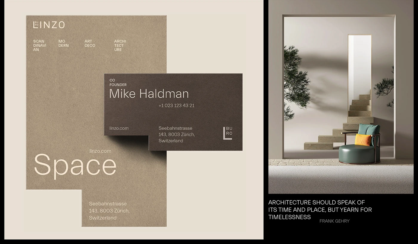
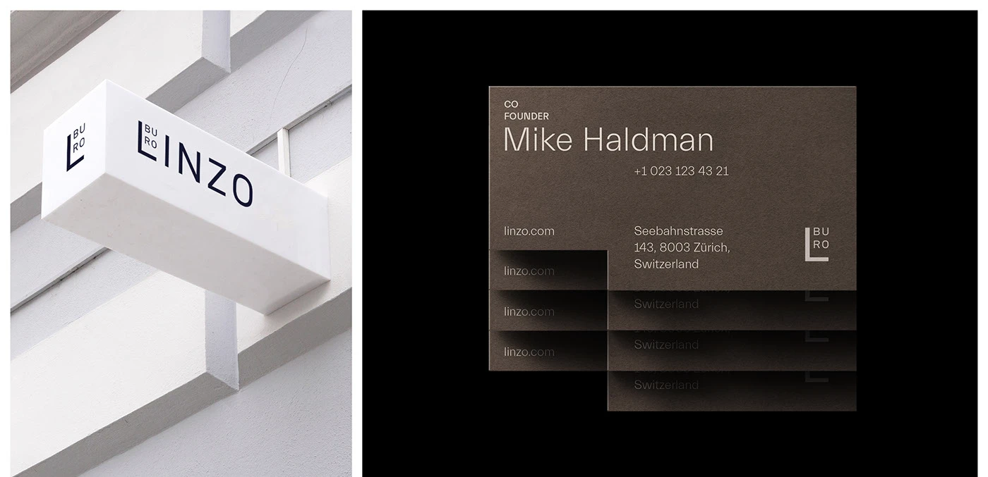
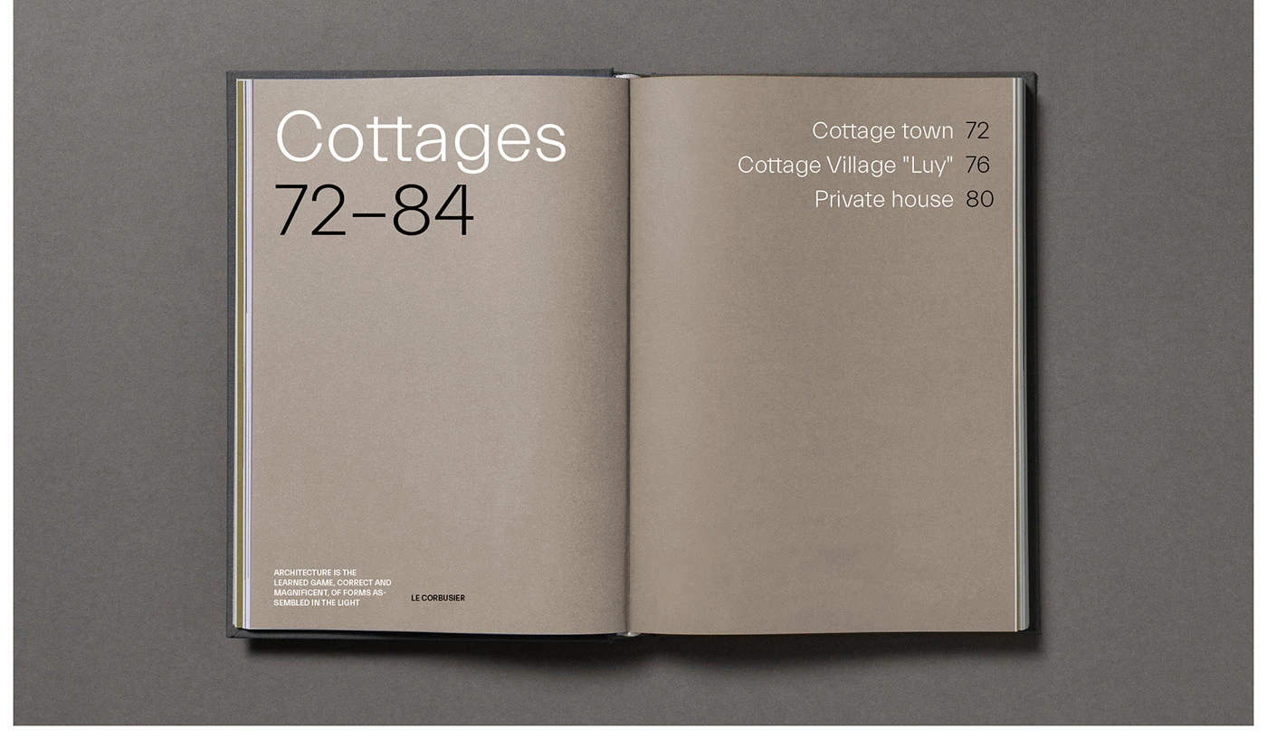
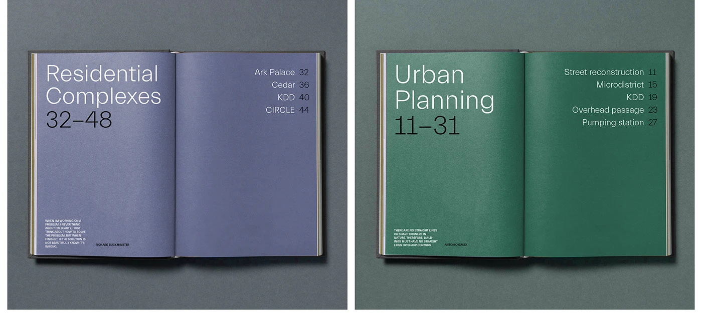
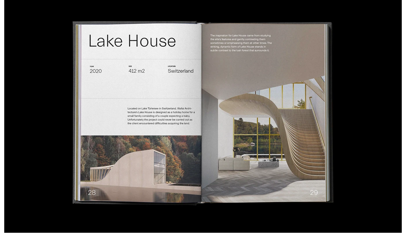
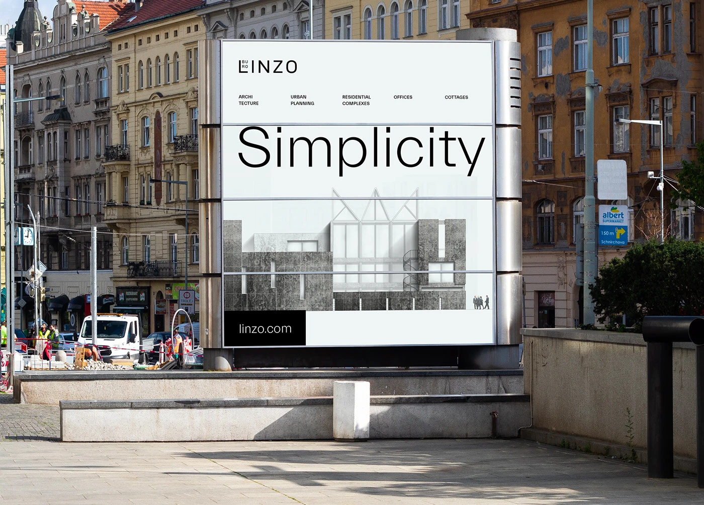
The identity extends across signage, business cards, catalogues and campaign materials. Large type, generous margins and a restrained palette create a shared rhythm without competing with the architecture.
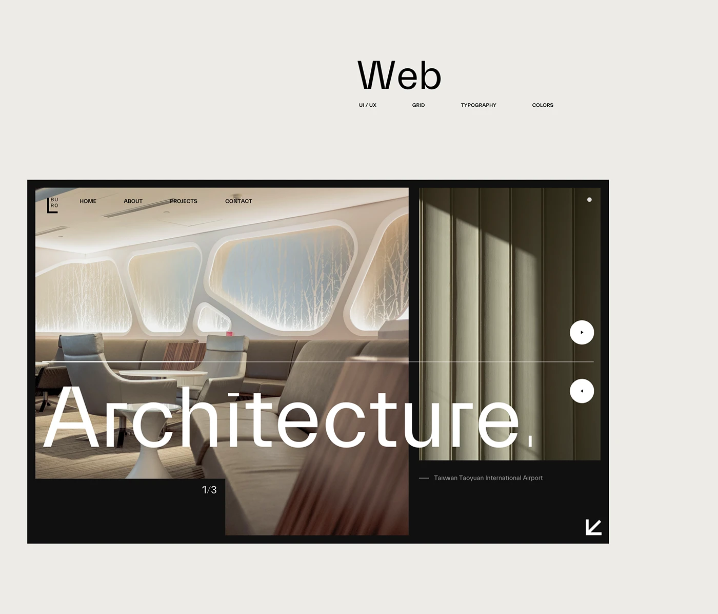
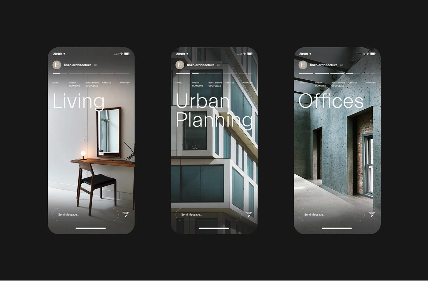
On screen, the same principles shape the project pages and mobile layouts. The website brings imagery and information together through a clear hierarchy, carrying the studio’s character from the printed page into a digital setting.
Credits
Created with Apo Branding