A bold identity for a company building what comes next.

Overview
Where code meets creativity.
Chekov Enterprise GmbH is a software development and IT solutions company. The project brings together its brand identity, tone of voice and website, giving a technical business a confident, expressive presence.
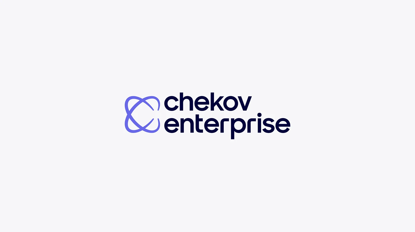
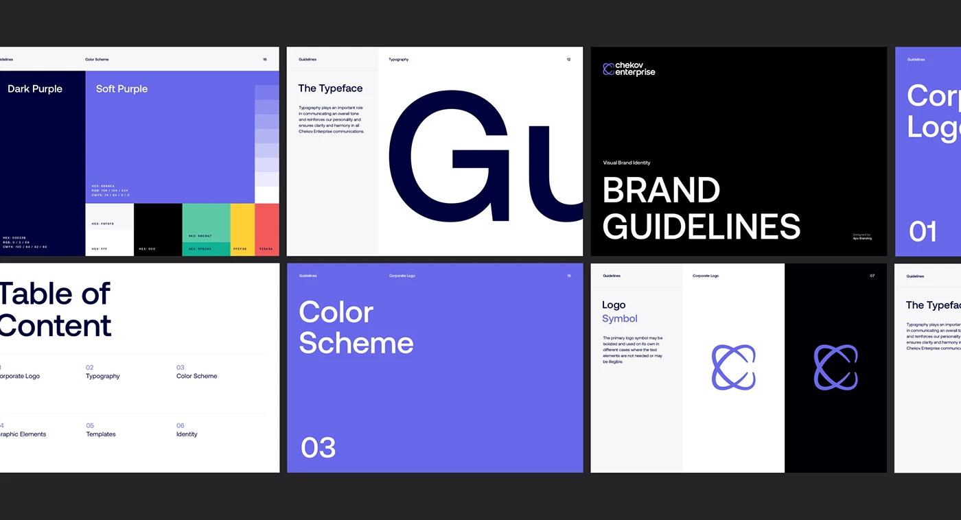
Violet leads the palette, paired with black, white and a set of supporting colours. A fluid, interwoven symbol sits alongside a clear wordmark. Together, they give the identity a recognisable starting point for everything from business cards and documents to the website.
Services
Brand identity, Tone of voice, Copywriting, Visual identity, Web design
Year
2024
The visual system
One idea, across every touchpoint.
The brand voice is direct and energetic, with an emphasis on turning ideas into functional digital products. Dimensional graphics bring movement to campaign materials, while restrained layouts keep longer messages and interface content clear.
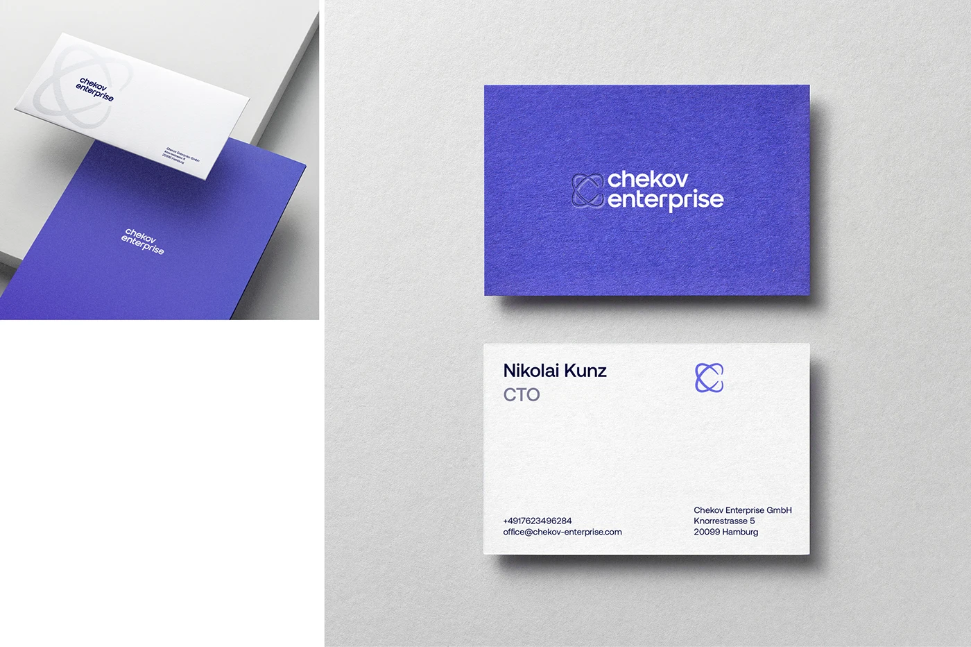
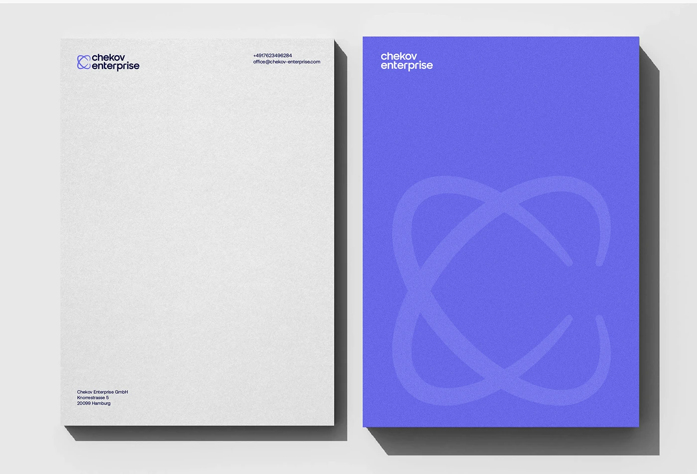
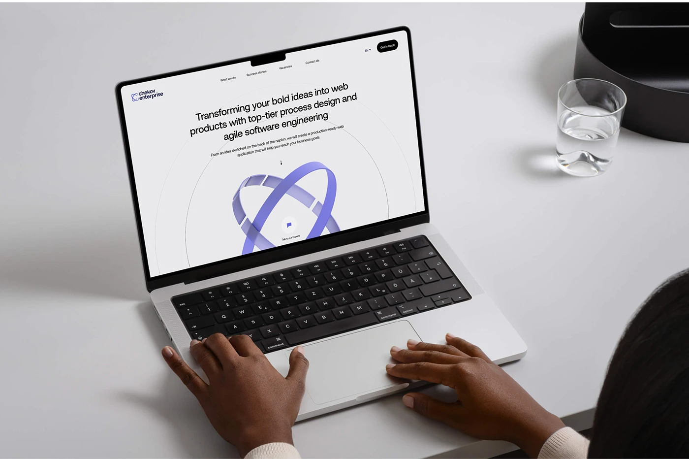
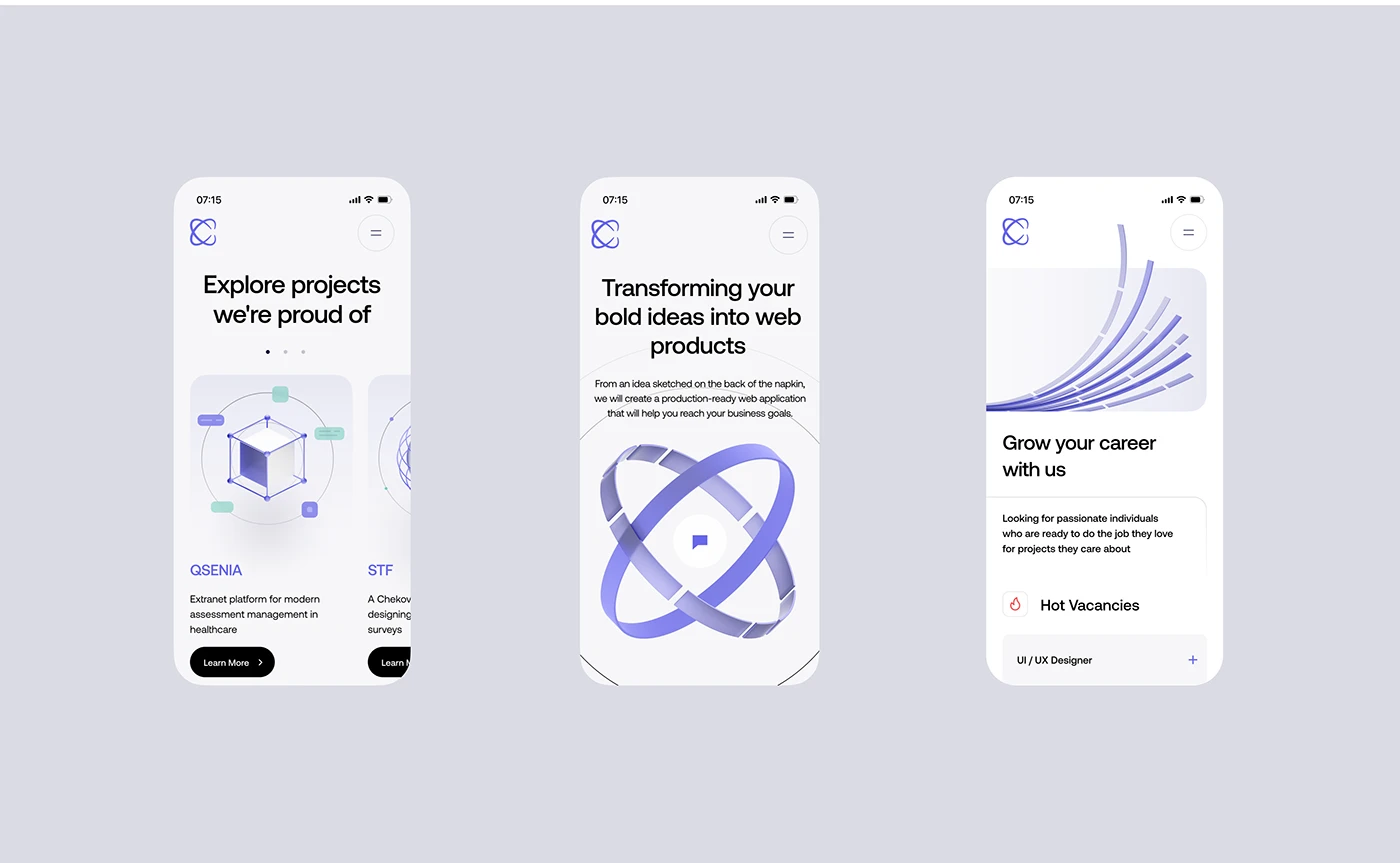
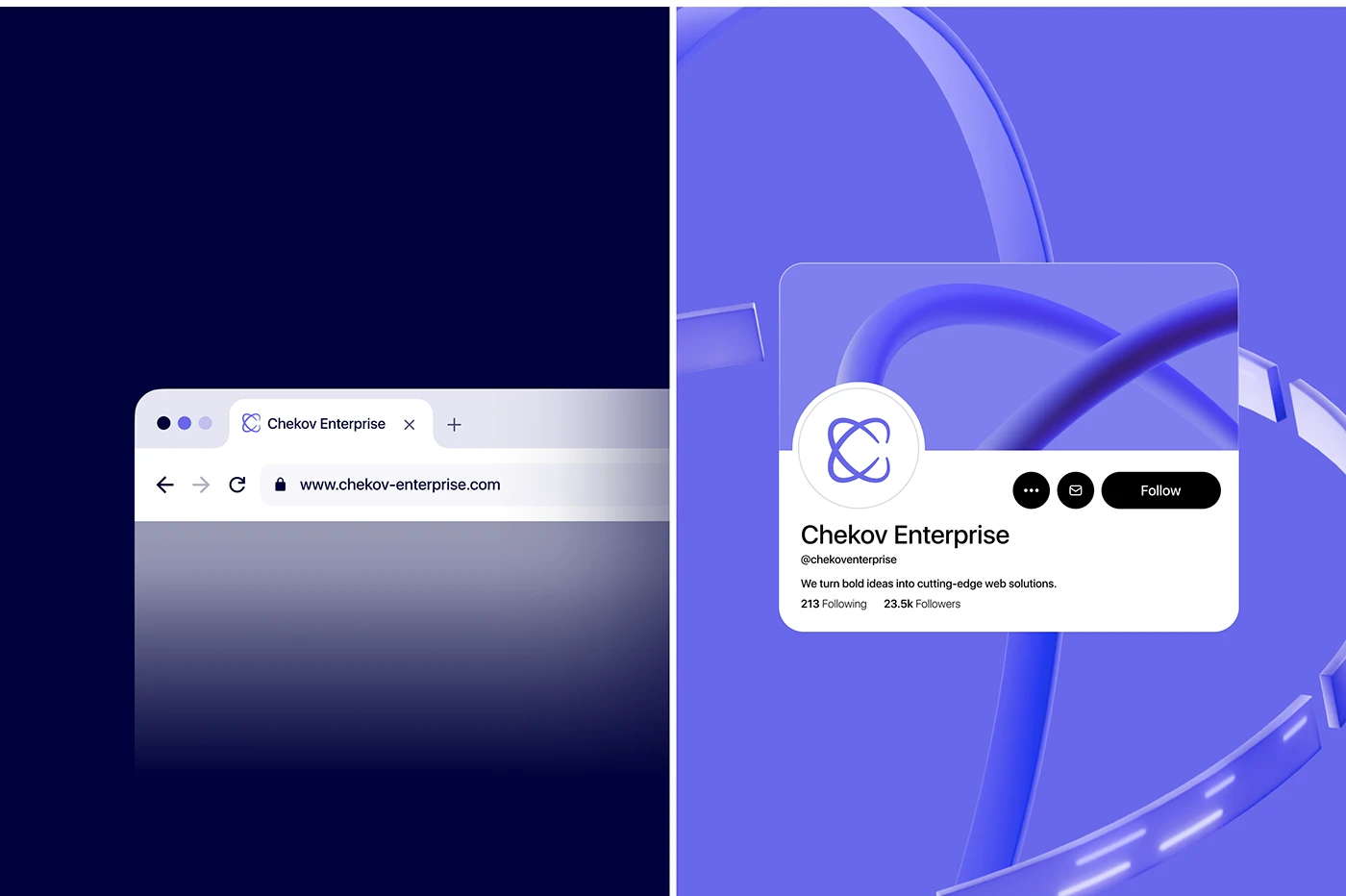
The same system carries through the desktop and mobile website, social applications, stationery and brand guidelines. It gives the work a consistent character while leaving room for different formats.

Credits
Created with Apo Branding